Despite the fact that we live in a predominantly digital age, graphic design for businesses & professionals for the production of print & other promotional materials is still a valid concept.
Select any link below…
PowerPoint Shows – in person or online
The effective design of print & other presentation materials is vital for portraying your company’s image and is often the first impression your prospective customer will have of your business.
Business cards | Brochures & Flyers | PowerPoint Templates | PowerPoint Shows
Business Cards
Your business card says a lot about your company and is probably the first piece of promotional material seen by your prospective customers – possibly even before they visit your website – after all, where else would they read the web address during your first in-person meeting?
It is wrong to believe that business cards are redundant in this digital age. A business card is an invaluable networking tool which immediately identifies your company and facilitates connections with others when attending events and allows you to easily provide others with your contact information.


Your business card instantly projects your business image as being either professional & reliable or amateurish & cheap.
A well designed card not only provides contact information about you and your company but more importantly, it establishes your image by incorporating your corporate identity & your value to your clients.

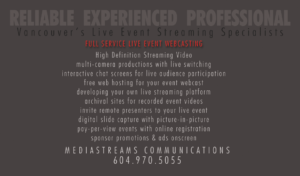
The front of the card is used to establish your company purpose, while the back can be utilized for all your contact details, or vice versa. Glossy or matt, full color or simple black and white, incorporating your photograph & logo or just plain text –
Here are 5 reasons why it is important to have a business card handy:
- A Direct Exchange of Contacts – by exchanging cards in person allows you to introduce yourself and open a conversation with people – making other professionals more likely to call you back.
- Makes a Good First Impression – Your business card is a representation of you personally as well as your company. It provides all the information about your business, making it easy for your prospect to contact you should they need to.
- Showcases Your Professionalism – Having your business card ready at networking events and meetings shows that you are a well-prepared and focused businessman. It implies that you are ready and confident to put your name and your brand out there.
- Facilitates Referrals – If your business card has a unique or creative design, there is a good chance of people sharing your business card to others, which further markets your brand. This increases your chances of getting a referral.
- Sheer Convenience – Business cards are supremely portable, especially when popped into a ‘card jar’ at an event.
Business cards may seem outdated to some, but they continue to be an important tool when it comes to Marketing & Networking.
Business cards | Brochures & Flyers | PowerPoint Templates | PowerPoint Shows
Brochures
Even in this digital age, a company brochure continues to be an integral part of your branding process.
It’s a vital piece of literature that provides even more details about your products and services than a business card – and if its well-designed, it does so in a professional comprehensive way that advertises your brand value and other important information.
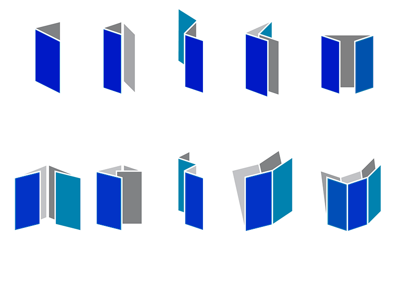
Brochures can be single panel, single panel front and back, single fold with 4 panels, tri-fold with 6 panels, accordion fold, book fold, etc., depending on how much information you need to provide. They can be any finished size, from 3X7″ to 11X17″ – see the types of brochure folds in the diagram below:
Keep the design simple- include a brief introduction. You want to limit the amount of text and instead have a persuasive design with images. The cover copy should peak your customer’s interest, persuading them to delve deeper into the brochure. Too much content is counterproductive.
The copy should always communicates a positive message about your company that will encourage people to want to use your services. State exactly what services you provide making it clear so that the reader knows what they can expect from you.
And last but not least make sure your contact information is on your brochure – telephone numbers, website address, email addresses, social media handles, etc., this may seem obvious but we have seen a number of brochures leaving out this critical detail.
Effective Graphic Design for Businesses & Professionals – still a vital concern even in this digital age
Business cards | Brochures & Flyers | PowerPoint Templates | PowerPoint Shows
PowerPoint Templates
Way too many presentations are displayed on a mundane template pulled straight from PowerPoint itself, making them look and feel humdrum. This makes the viewer believe that the presentation either represents no one in particular or that the organization it represents has not bothered with portraying its corporate image.
Check out the Gallery images below and compare the ordinary type of template found in Microsoft PowerPoint (1st. image) with the custom slide templates created for a client (images 2-4)
Microsoft’s templates may be OK for one-off presentations where the presenter is an individual not attached to any particular organization. However for those who represent a company or association where branding is an important factor, a well-designed, custom template is essential. This has value not only for branding purposes but the template can be used and reused, making all future presentations conform to the same brand identity.
More goes into building a custom template than just a fancy look…
- A relevant background image
- Header or footer just like on a website
- Incorporating the company logo into the header or footer
- Placement of the company logo (not many folks know the optimal position of the logo on a slide)
- Text with font design for headers, text-boxes, etc. to promote standardization of fonts across slides
- Which font will be most effective – serif or sans serif?
- Standardizing text animations – plain dissolve or slide bullet points work best, while having that horrible mixture of 20 different text animations across slides give the presentation a definitely amateurish look.
- Selection of the basic color scheme that is most representative of the organization’s purpose
- Standardization of all the various slide types for fonts, colors, etc., to make it easier to build a presentation.
- An standard Intro slide that clearly lay out the company brand and has space to incorporate the presentation’s objective.
- A custom background image for the intro slide is a huge advantage (the same image can be used watermarked for the inside slides)
- An Intro animation or a short introductory video of not more than 5-10 seconds can add a lot of zap to any presentation.
Paying attention to these and other factors will markedly improve the effectiveness of your presentation, giving your organization’s brand a professional feel that is designed to impress your audience.
Good Graphic Design for Businesses & Professionals – still a powerful promotional tool, even in this digital age
Business cards | Brochures & Flyers | PowerPoint Templates | PowerPoint Shows
PowerPoint Slideshows
Good Graphic Design for Businesses & Professionals encompasses more than just print materials. Well designed PowerPoint slideshows and templates are yet another powerful means of business promotion.
A few examples of PowerPoint Slideshows developed by us with Animated Intro Slides and with full interactivity control within the presentation
| First Quantum Minerals | Micrologix Biotech Inc. | Slocan Forest Products |

|

|

|
For streaming video production visit us at Mediastreams Communications

